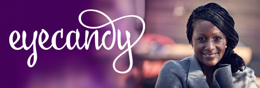
Eyecandy was launched in South Africa in 2007 and pioneered the commercial brow threading movement in the country. Its founder, Freda Isingoma, tasked us with creating the brand from scratch, including the positioning, broad identity and tone of voice.
The logotype was designed to be fluid and playful with the final two letters joined by a thread, creating a sense of movement.
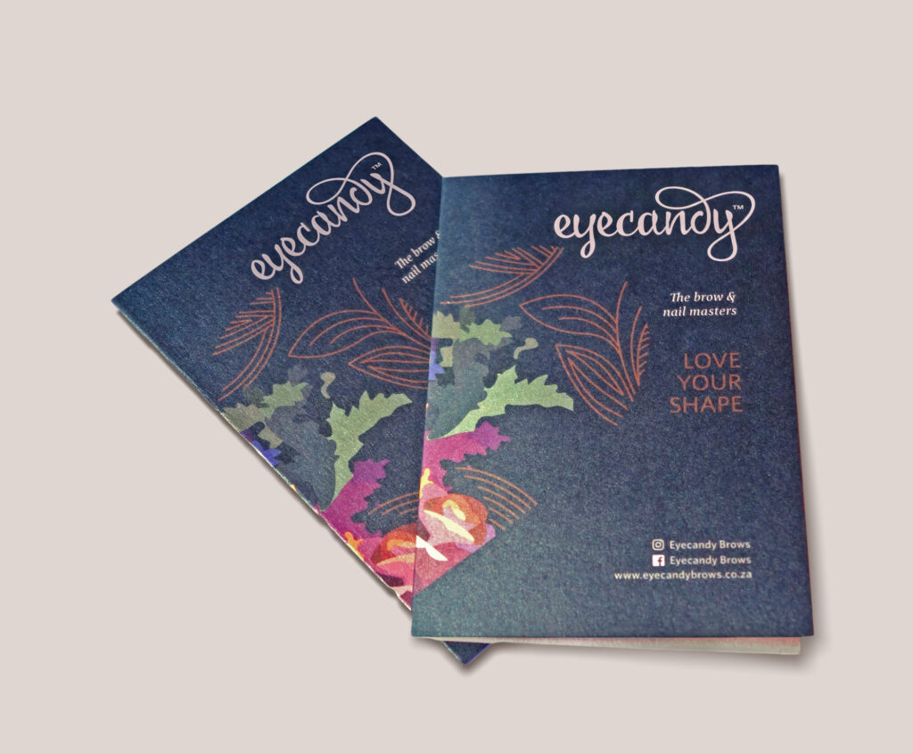
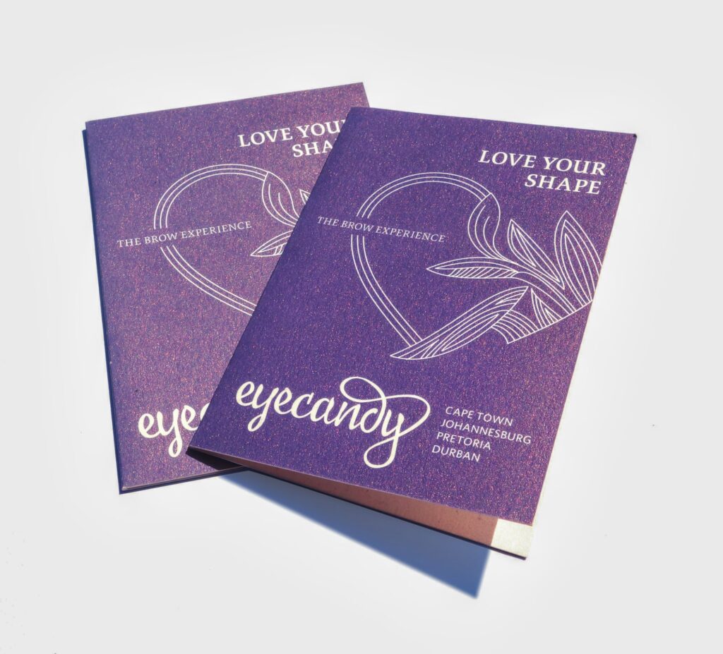
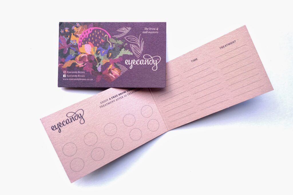
Because the beauty industry is constantly shifting, the brand was designed to work around a consistent logo but an evolving theme each season, which surfaces in the payoff line and informs the design.
The first season, shown on this page, led with the call of “Love Your Shape”. This was a nod to the idea that Eyecandy is not here to impose beauty but to rather take a person’s unique features and enhance them.
Art Direction | Branding | Illustration | Copywriting