Wildekrans Wine Estate
Rebranding the Wildekrans Estate Wine labels
Rebranding the Wildekrans Estate Wine labels
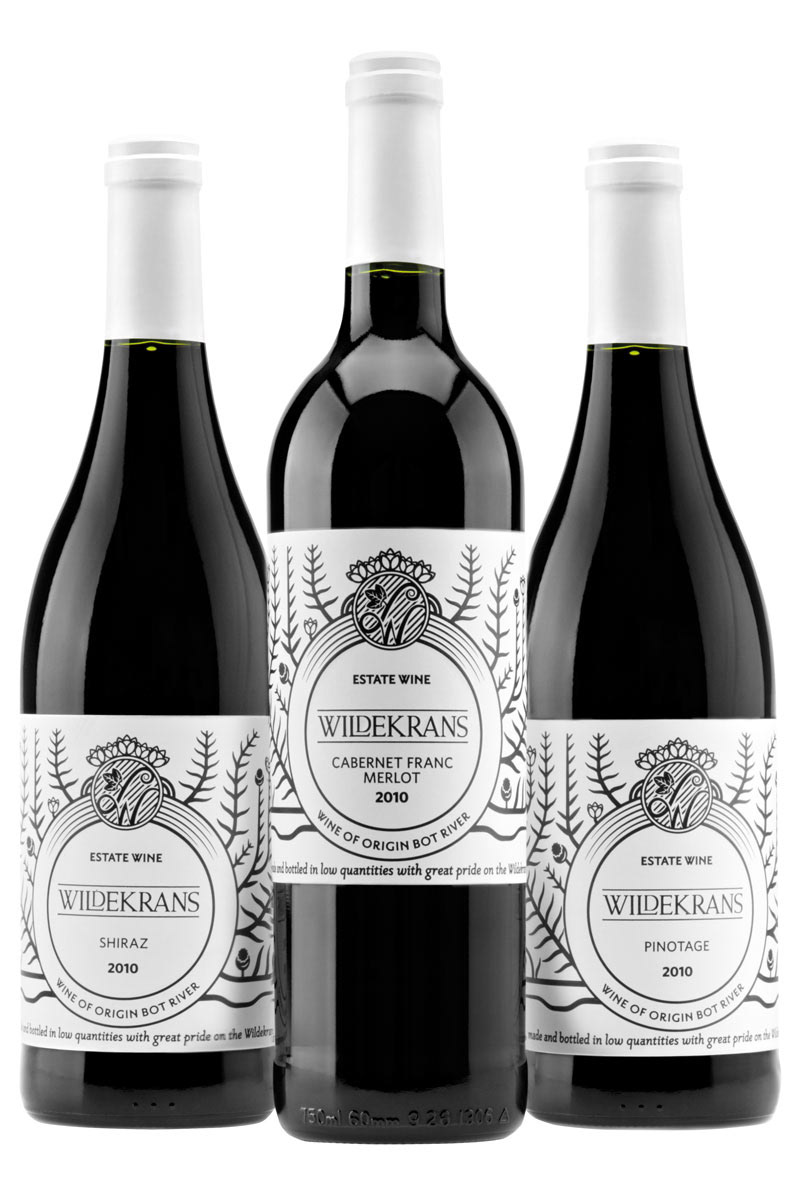
Wildekrans Wine Estate lies along the Bot River near Hermanus in the Western Cape, South Africa. All their wine is grown, made and bottled on the Estate in relatively small quantities.
One of the standout aspects of the beautiful estate is the unique vegetation. Renosterbos, a variety of the rare Fynbos shrub, covers large areas of the farm. We decided to base our design on the Renosterbos as it's only due to the unique environment that it is able to grow in the area, an environment that also provides the Wildekrans wines with their distinct flavour characteristics. The Renosterbos becomes a great representation, therefore, of the terroir.
One of the standout aspects of the beautiful estate is the unique vegetation. Renosterbos, a variety of the rare Fynbos shrub, covers large areas of the farm. We decided to base our design on the Renosterbos as it's only due to the unique environment that it is able to grow in the area, an environment that also provides the Wildekrans wines with their distinct flavour characteristics. The Renosterbos becomes a great representation, therefore, of the terroir.
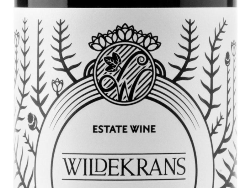
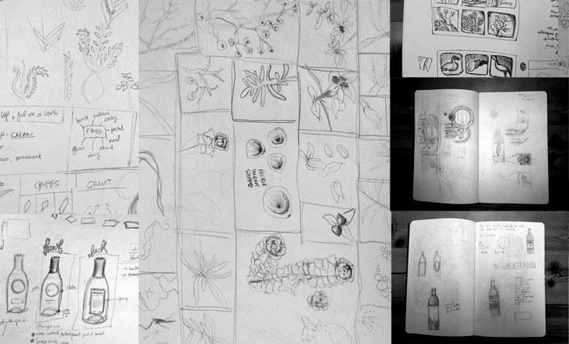
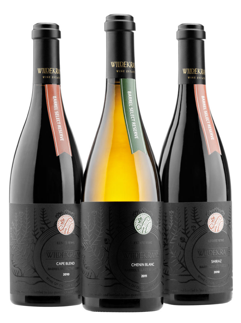
We wanted to create a balance between a classic design and a new interpretation so we created a stylised illustration of the Renosterbos arranged in a traditional, French flourish layout. The style is simple and angular, which is representative of the plants and the hard terrain.
The traditional Wildekrans colours are black and white. We kept the labels for the mid-range wines to a simple, single colour design. An emboss was added, tracing the floral design, to give the labels some tactility.
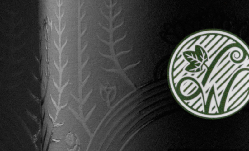
For the premium range of wines, we decided to go with a predominantly black label. After seeing a lot of wines in retail outlets using bright colours and expensive foils to attract attention, we felt it would be better for the premium wines to whisper rather than shout. We initially tried just an emboss to produce the floral design on the labels but couldn't achieve the depth we needed to catch the light so we scrapped the original print run and used an emboss with a varnish instead.
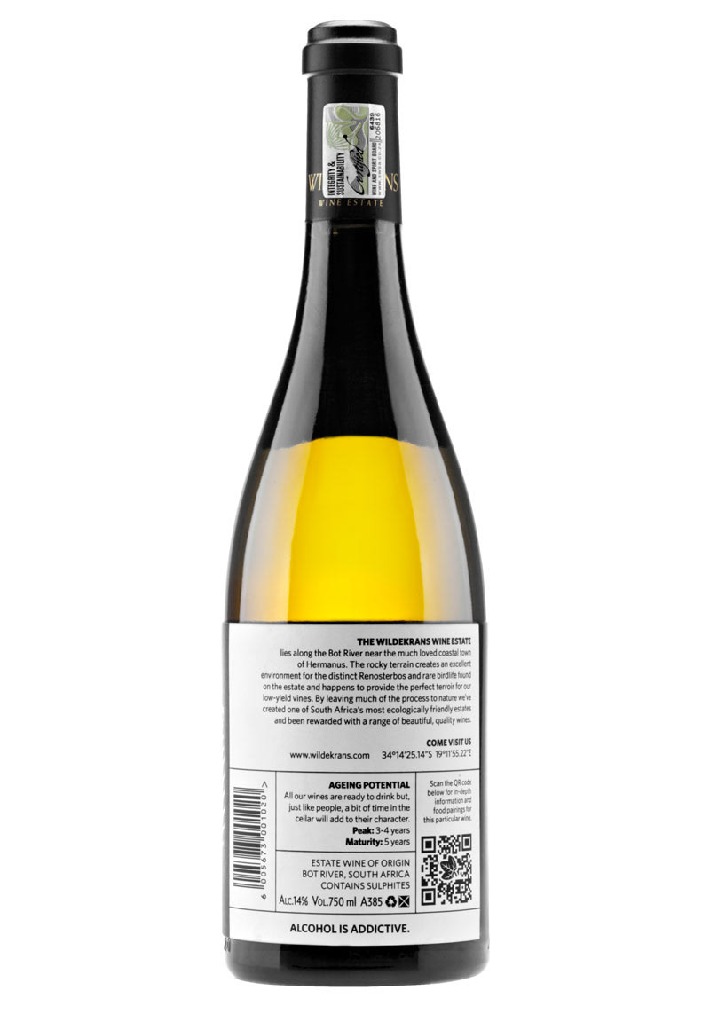
Information on the back was kept as simple as possible. We provided basic information about the estate and allowed interested drinkers to access detailed viticultural and harvest information via a QR code.
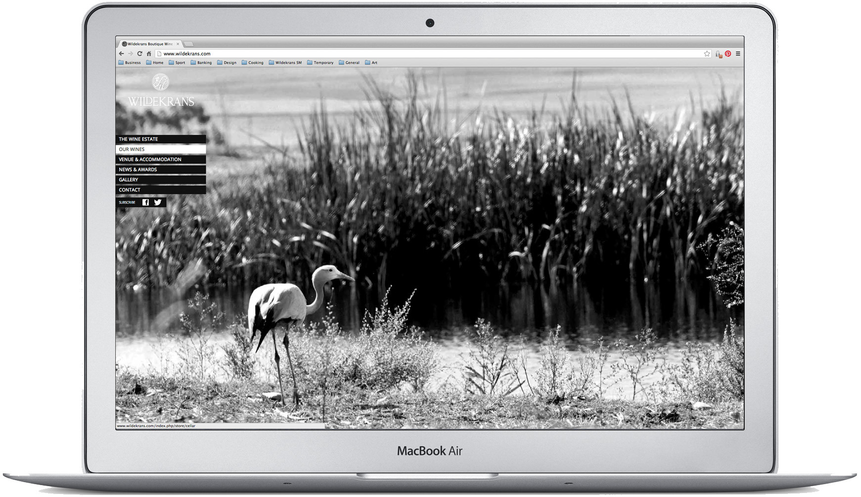
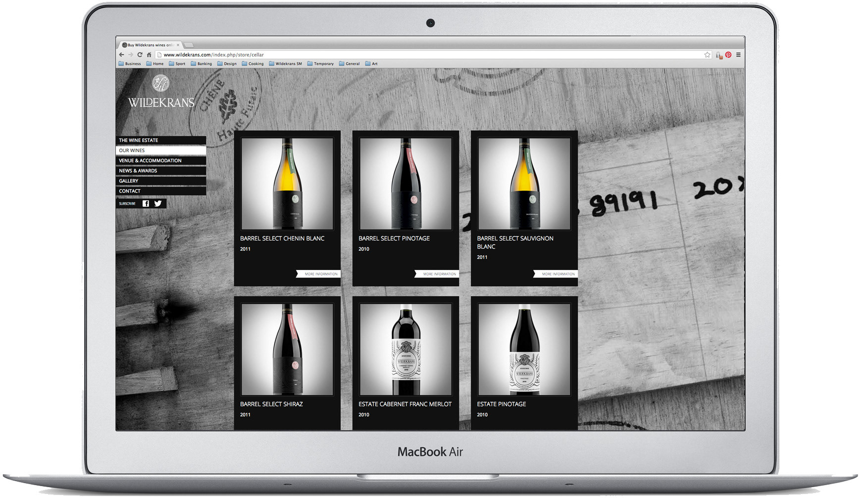
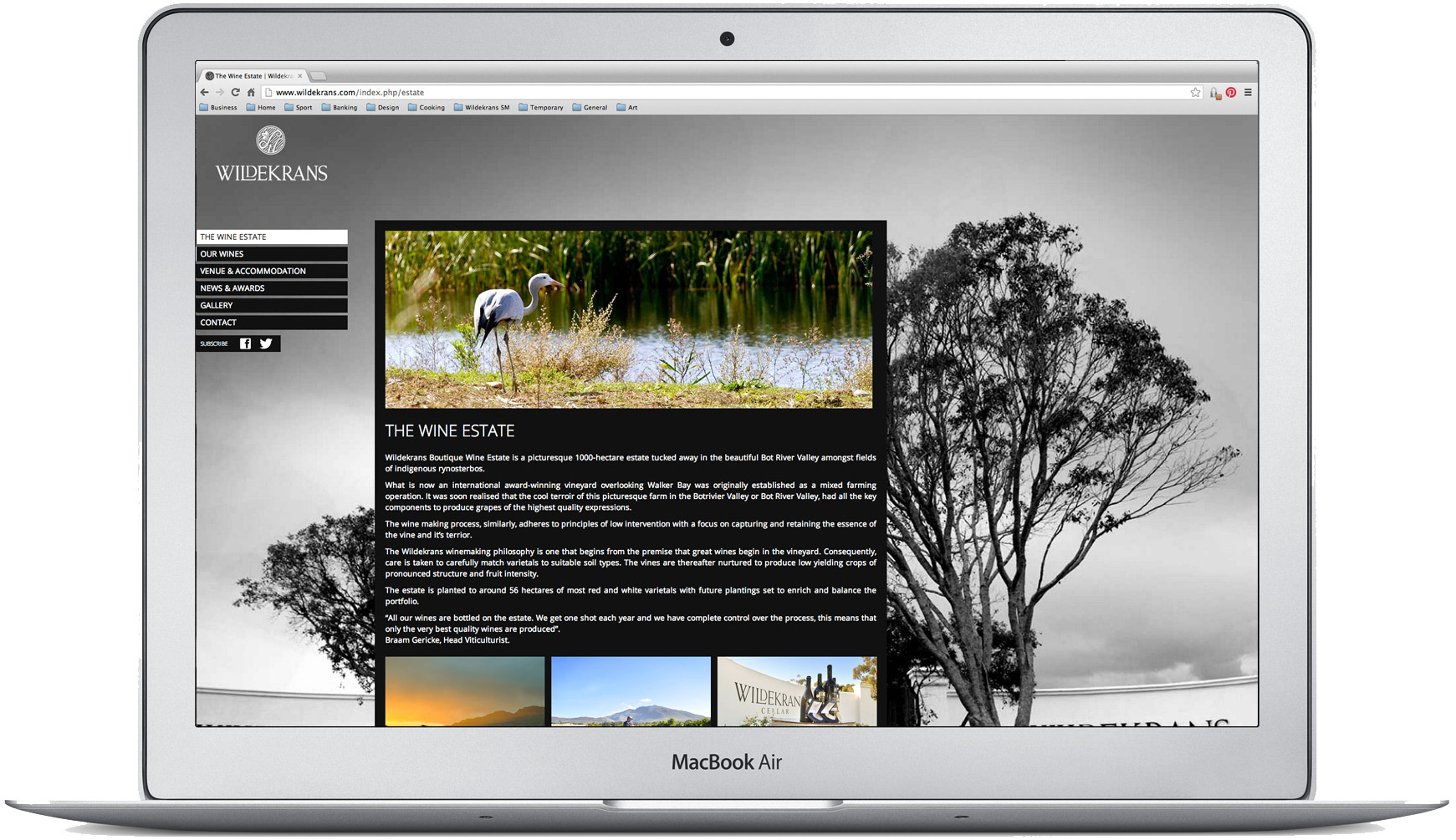
Created in collaboration with Cavalry, the responsive website follows the art direction that we set out for Wildekrans; dominant black and white imagery with colour images providing foreground highlights. Again information was kept simple with just the necessary details rather than aggresive marketing messages.
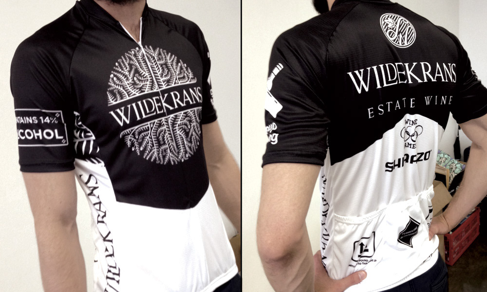
To prevent stagnation, collateral elements have been treated on a case by case basis. The large 'floral' crest design was illustrated by Gawie Joubert and has been predominantly used on clothing executions.
Credits
Creative Director: Barry Maitland-Stuart
Typography: Jessica Paulo
Illustration: Gawie Joubert
Design: Nikki Brand
Website Development: Cavalry