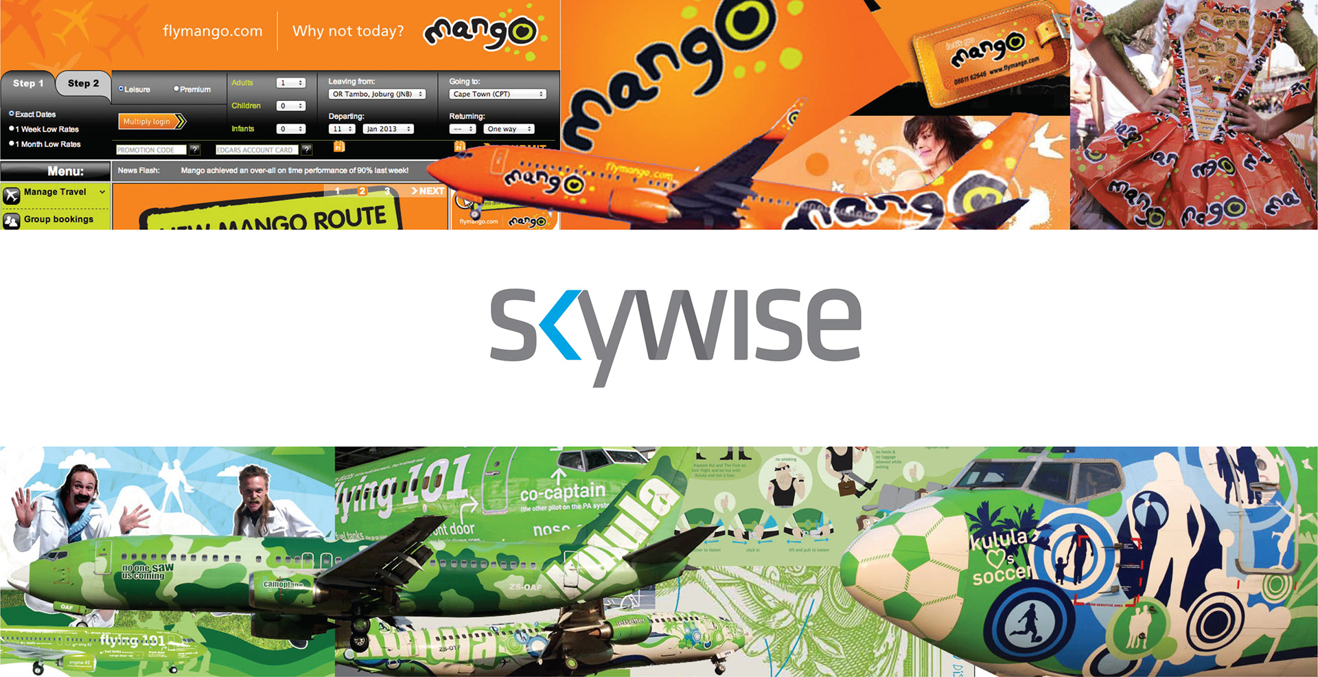
Set to launch in October 2013, we were approached to develop an identity for the new low cost carrier. South Africa has seen a few budget airlines come and go but currently the market is dominated by two, Kulula and Mango. Both tend to employ bright colours and visual flooding as part of their visual identity. Kulula in particular is know for their quirky on board announcements and marketing messages.
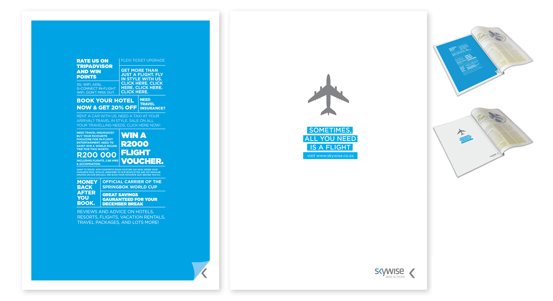
Given the opposition's positioning and the fact that the new carrier would need to keep costs extremely low in order to provide competitive pricing, we took the approach of visual and information minimalism. Both competitors offer bundled in options from travel, hotel stays, car rental, loyalty memberships and so on. Our strategy proposed that if everybody else is offering so much, we should offer less.
Sometimes people just want to travel from one place to the next without being bombarded with optional extras.
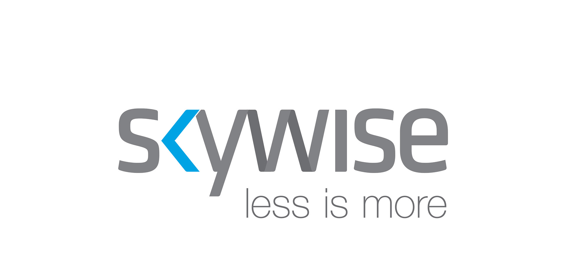
We unashamedly took inspiration from the people that do minimalist design the best, the Swiss. We decided early that the logo should be type based and we searched for the 'catch' in the logo that would echo the strategy. It jumped out pretty quickly, the less than sign. With both the logo concept and the strategy feeling solid, we pushed on.
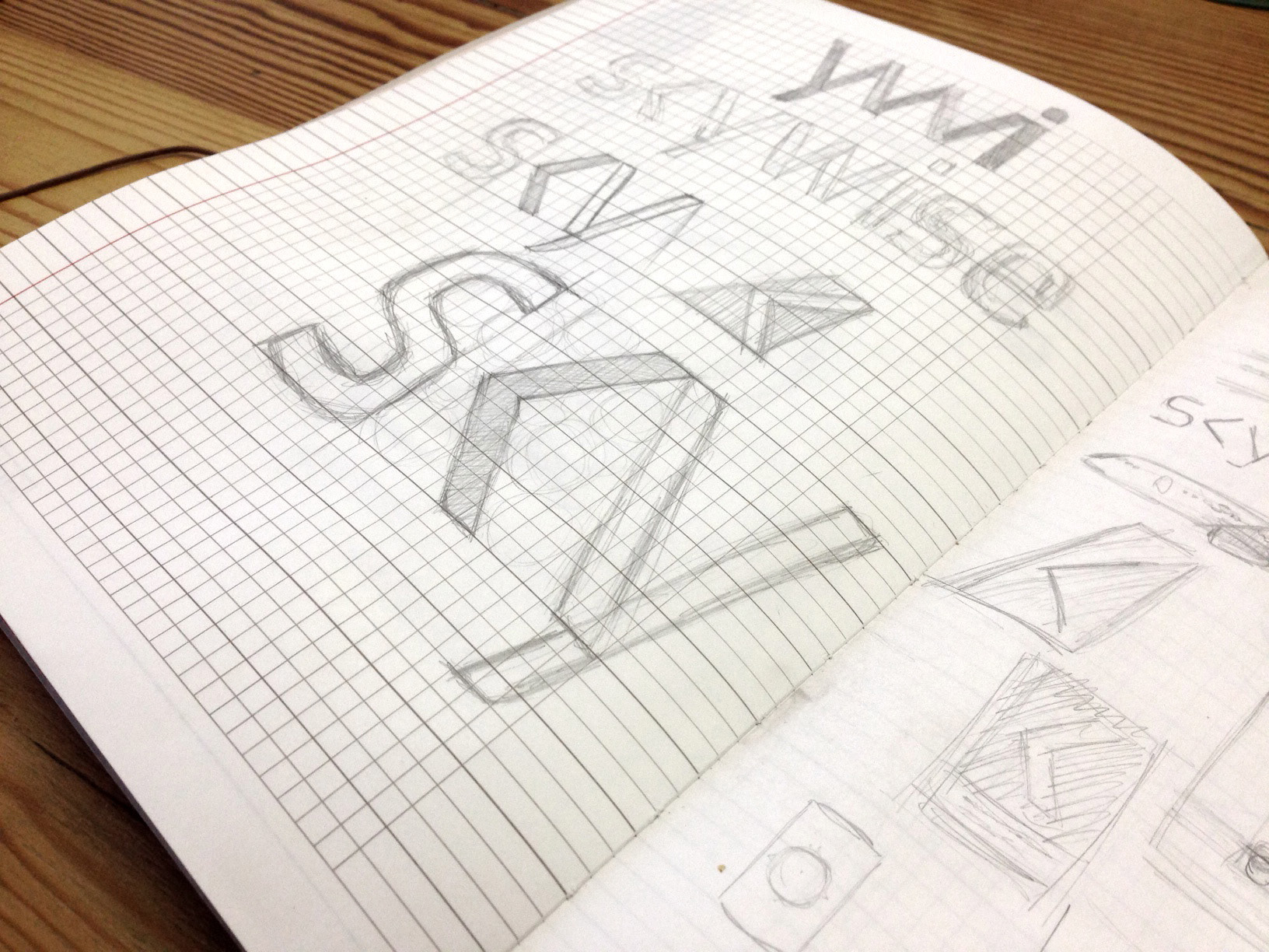
Using Klavika as our starting point we redesigned some of the elements by hand, scanned them back in and customised the typeface. We wanted to soften some of the edges and create some streamlining.

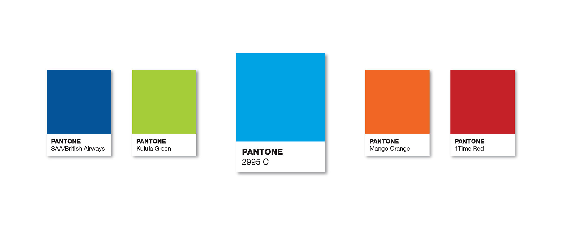
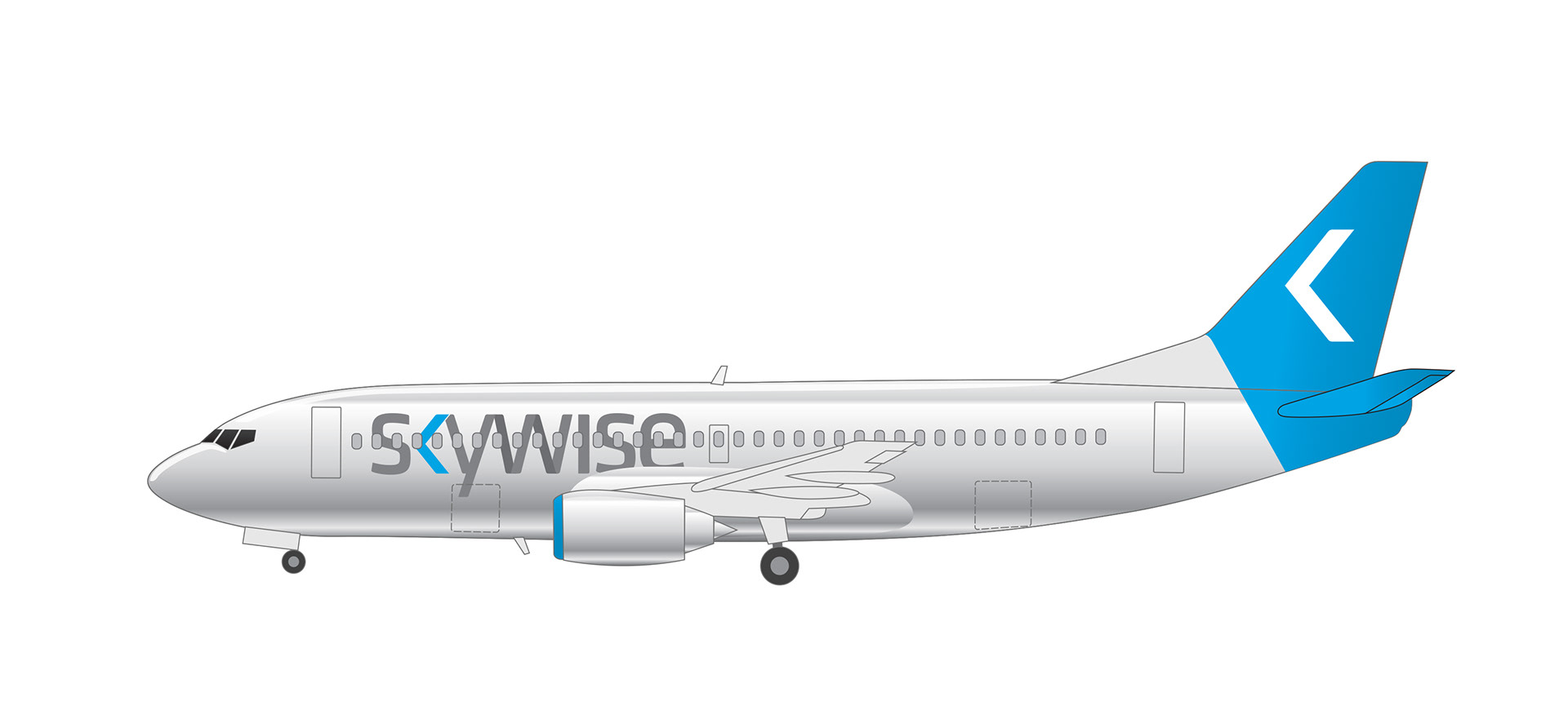
The positioning follwed the strategy and referenced the logo symbol quite easily. The colour pallate was based on both the airline's name, sky, and was set to occupy a space between the competitors. Blue tends to have a calming affect when used in certain combinations and hues and followed our philosophy of not needing to shout.
The airline bought a fleet of second hand 737-300s. They're not the newest planes but that's nothing a paint job can't fix. Just like cars, the cleaner the plane looks, the more trustworthy it feels. We used high contrast lines and colour to give the plane a sharp image but again kept the style simple. Partly to keep the style consistent but also to keep costs down. Simplifying the paint job means less money and downtime spent preparing the planes.
By pointing out that the opposition bombard customers with offerings, most of which are unnecessary to the average flyer, and 'comedic' flight announcements that become quickly tiresome after the third flight, we reinforced our position that offering less is a good thing.
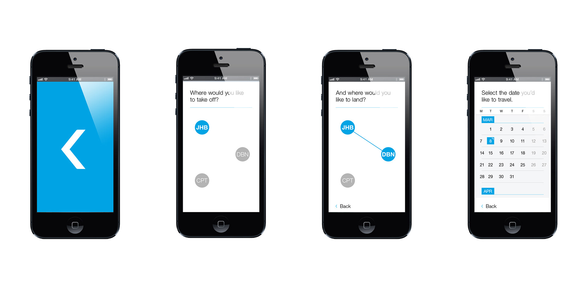
Our message tone is kept conversational. We want to treat people like adults that know what they're doing and not get in the way of them doing it. The app interface, for example, is designed to communicate clearly and interact simply. No gloss and animations here. We've included the option to add a schedule and reminders to the user's calendar that shows clearly when they need to be at the airport for check in, how long that check-in window lasts and when they need to board.
Concept: Jessica Paulo and Barry Maitland-Stuart
Strategy: Barry Maitland-Stuart
Art Direction: Barry Maitland-Stuart
Design and Copywriting: Barry Maitland-Stuart and Micaela Reeves